Project Description
Phase 1: UI design & more
Background
A well-known international university commissioned an ESP (English for specific purposes) app to help learners with the vocabulary they need for the subjects they’re studying. For example, a student based in Mexico who is studying Engineering must complete some modules in English, and therefore needs to learn English engineering words. Traditionally, this is achieved by spotting an unknown word in a textbook or class and — if the student remembers to — heading to Google Translate or asking their educator to clarify. The goal of this app was to proactively teach useful domain-related words and phrases so that these students are better prepared when they encounter them in context.
When I joined the project, the wireframes and app flow had already been designed by the Junior Designer on the team, and I was brought on as a Senior Product Designer (UX/UI) to ensure the UX design (information architecture, microcopy and interaction design) was optimal and complete, and to transform the wireframes into high fidelity visual designs to hand over to an external development team.
Responsibilities
I was originally approached because the Junior Designer on the team had actually seen my talk about personas at UX Camp Brighton in 2019! The project didn’t have a huge budget, so a single full-time role was split in half between myself and the Junior. My responsibilities included:
- Review of the UX designs (wireframes, app flows)
- Finishing off the last couple of flows that had not previously been designed
- Creation of a visual identity and design system/style guide
- Development of high fidelity visual designs for all screens
- Refining and adding to user stories where needed
- Packaging up and handover to the external development team
- Mentoring and review of the Junior Designer’s wireframes and visual designs
Design system
I started on the project by creating a style guide and defining the design principles we would work to. The ‘feel’ of the app had already been agreed on as a ‘friendly academic’ type — knowledgeable, trustworthy, but approachable and fun. Based on this I was able to define the accessibility goals (AA), colour set, typography and some of the initial layout patterns. I also found a vector illustration set that met most of our needs, and we agreed that in future developments we could look into custom-designed illustrations. I continued to build upon this style guide in Sketch with new design patterns as they were needed for the app.
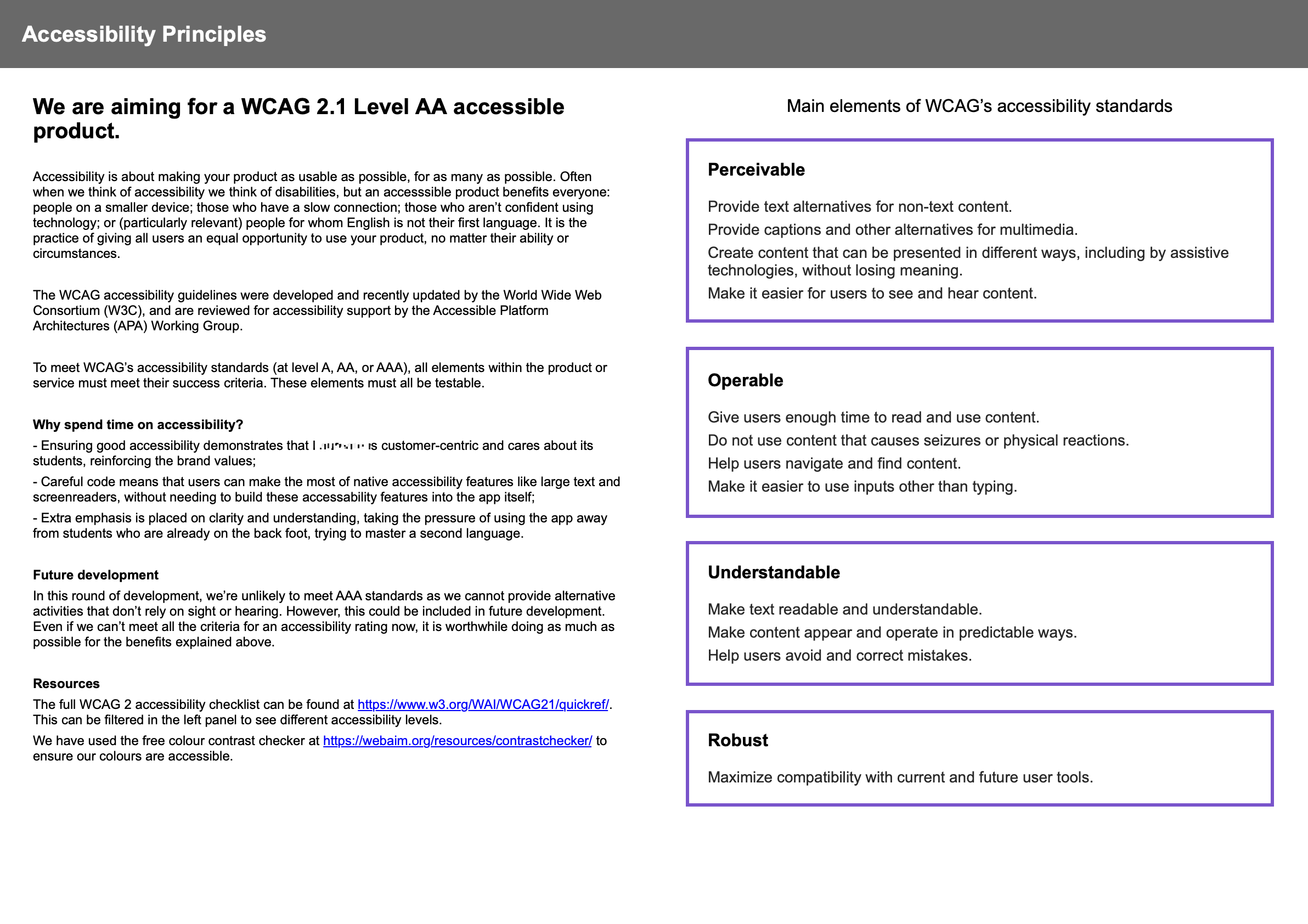
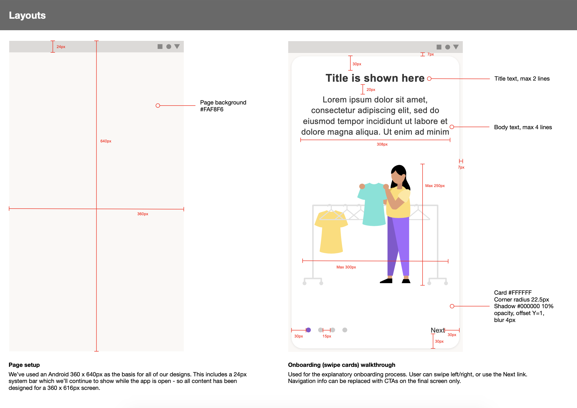
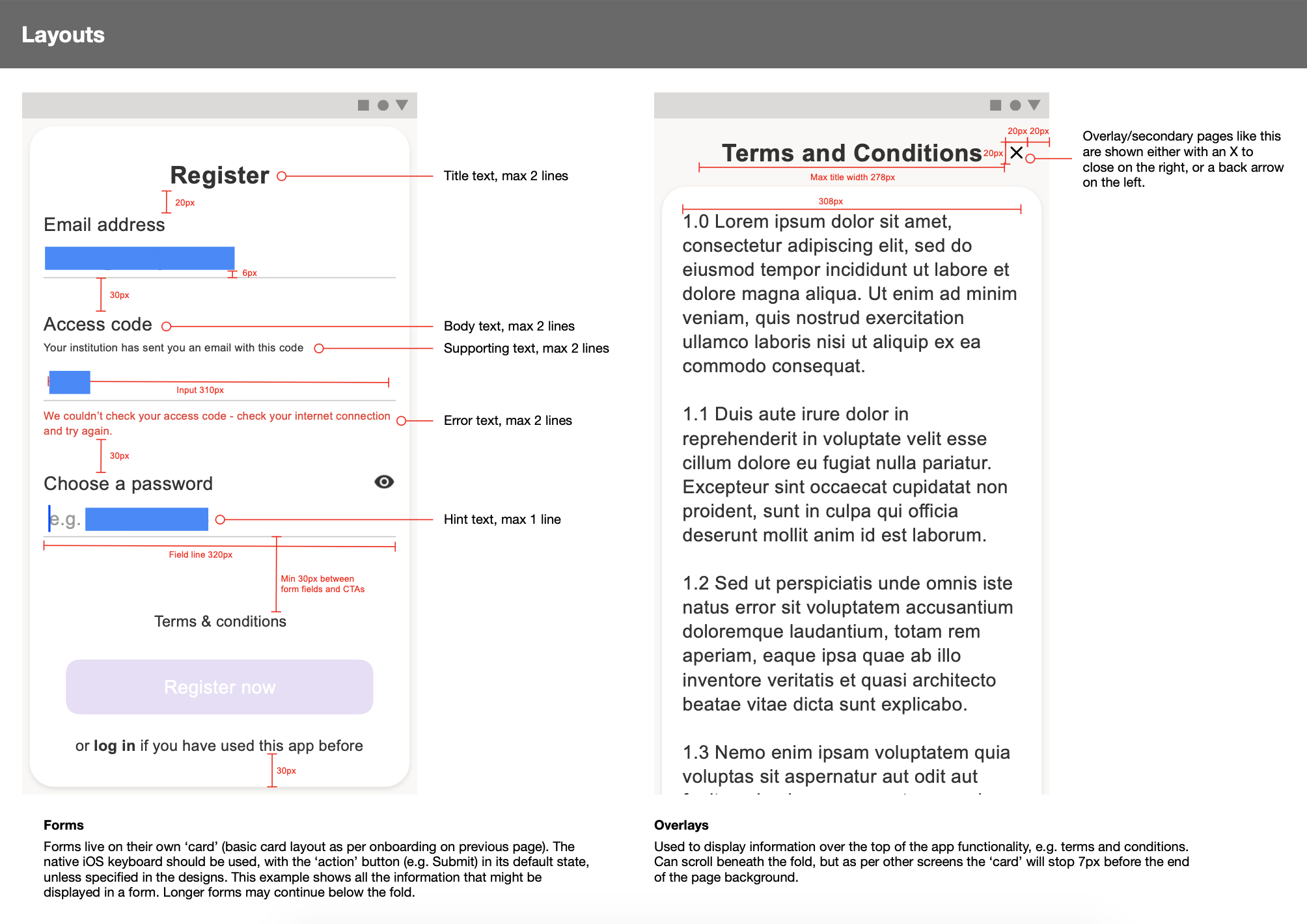
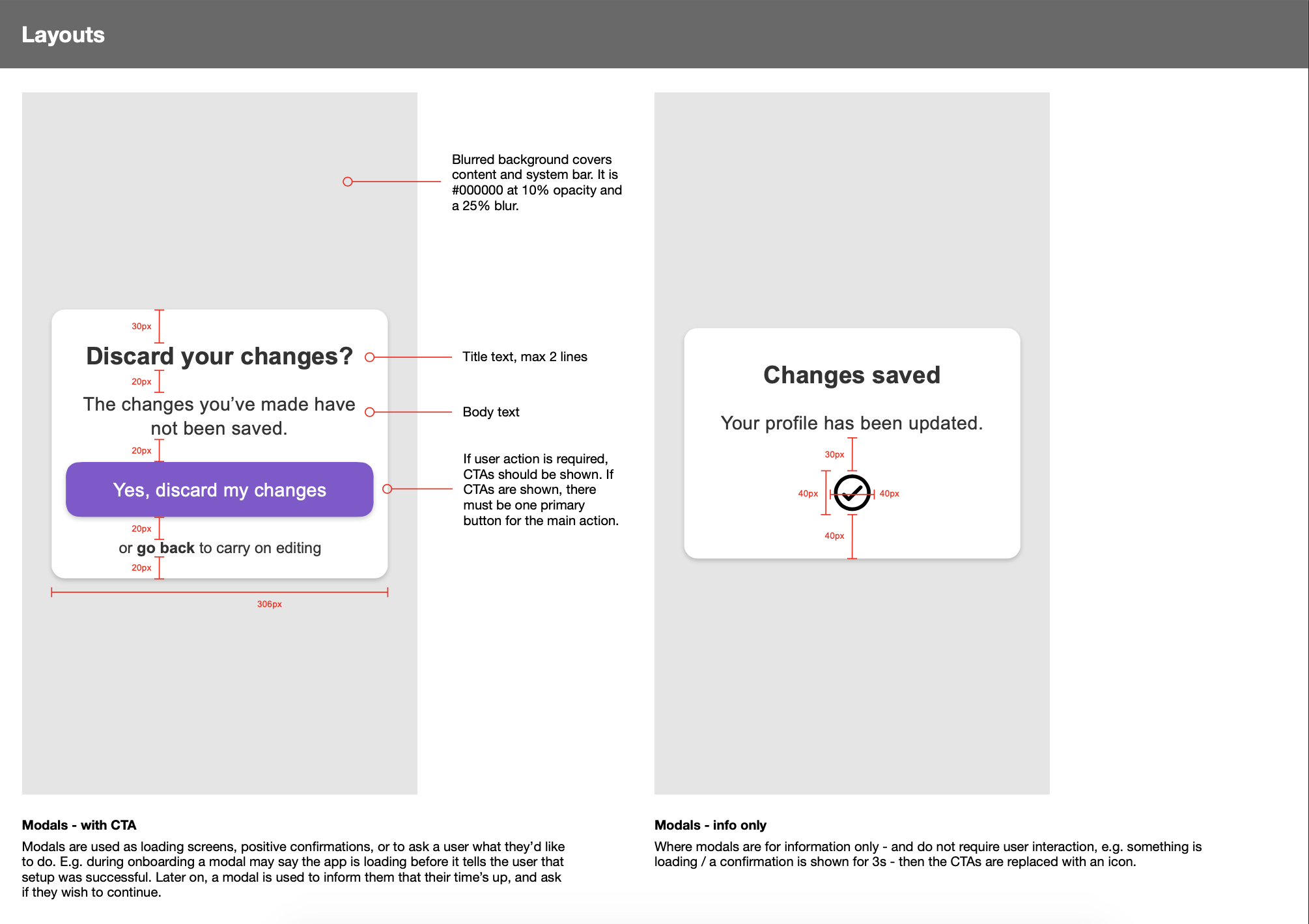
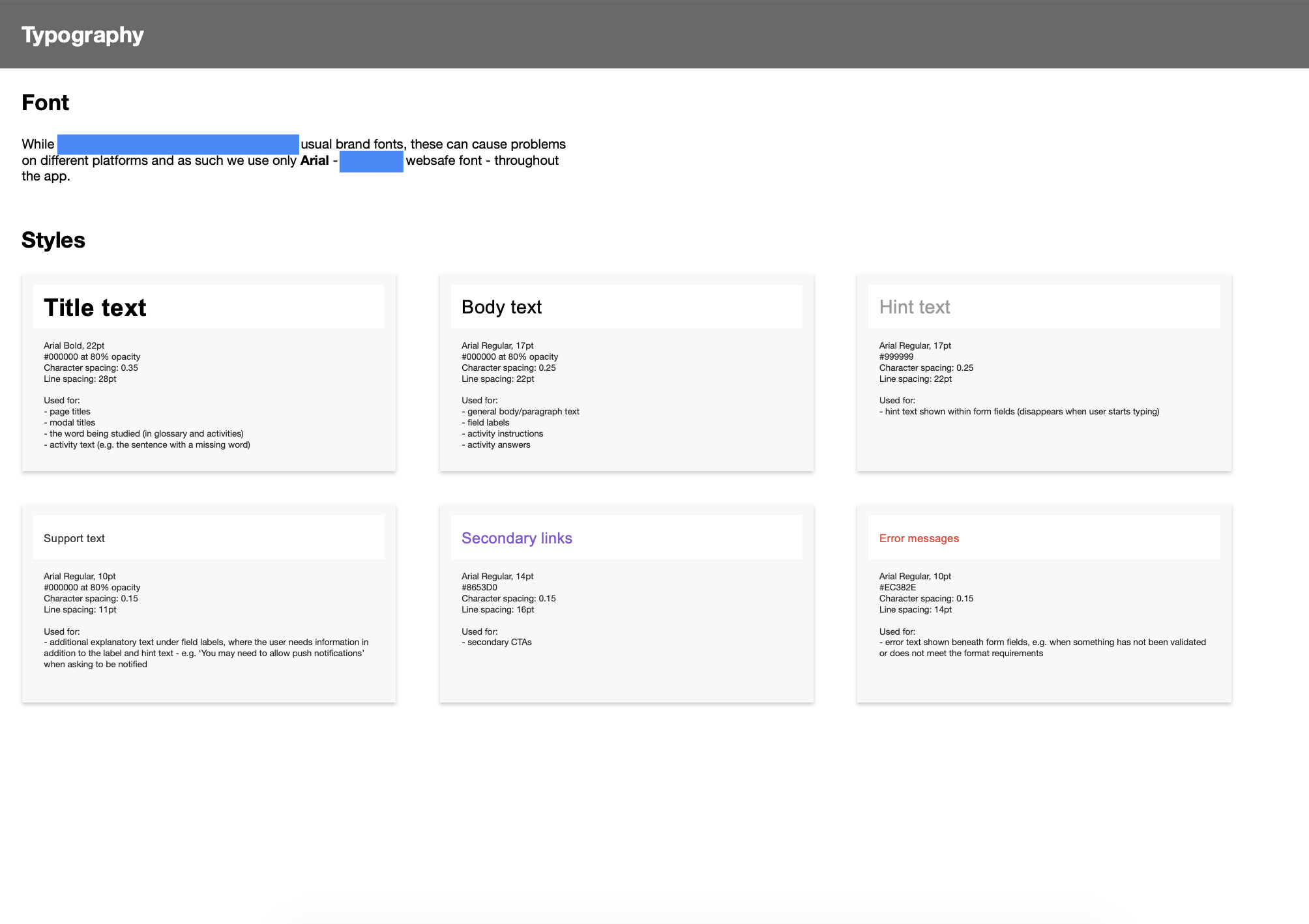
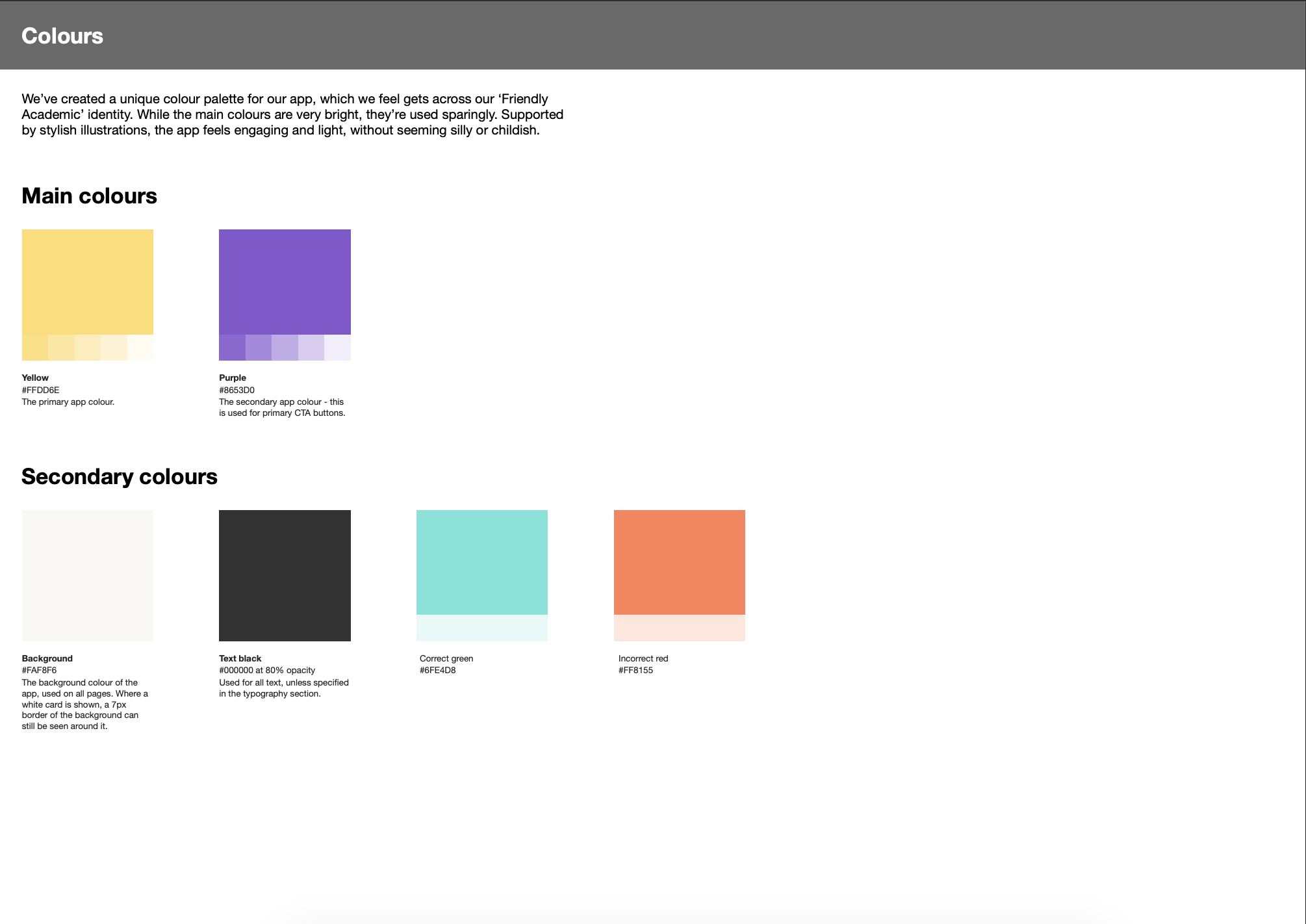
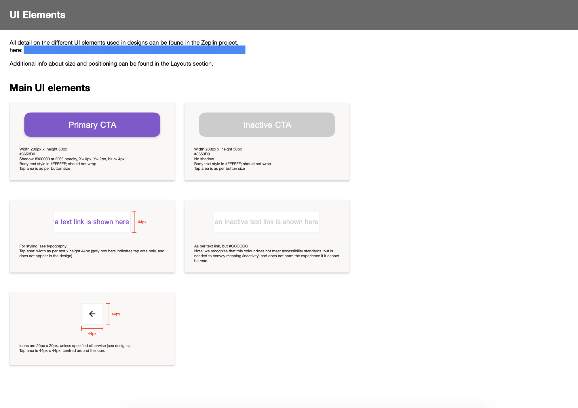
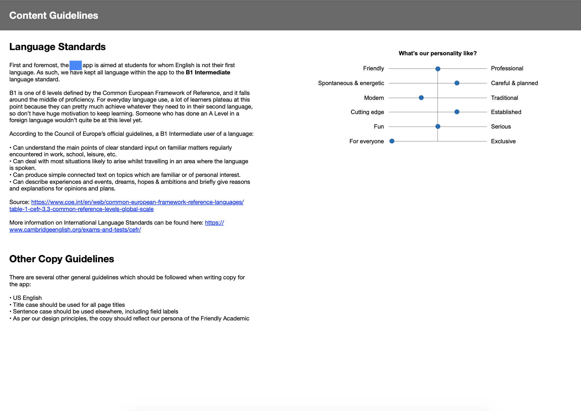
A selection of pages from the design system / style guide document
Usability testing
It was at this point — early in the project — that I realised there hadn’t yet been any usability testing done on with the app. The designs existed in InVision and with a little tidying, a prototype was created that could be tested with real students. I created a task-based testing script which combined testing key app areas, probing into future development opportunities and some ease-of-use metrics to benchmark progress, and coached the Junior Designer through the interview process. As the other designer was Spanish, she translated the interview script into Spanish and we set out to recruit our users.
Note: due to the small lead time and lack of incentive available to offer to interviewees (as it hadn’t been agreed in the original project scope), this was quite a small round of usability testing with only a few attendees. See the second project phase for more detailed usability testing.
The usability testing was generally very positive, and the learning exercises were received well. However, the home screen progression which moved words from ‘Learn’ to ‘Review’ and finally onto ‘Mastered’ proved problematic, so we redesigned this screen to be clearer for learners. Additionally, some new feature ideas were captured for future phases of the project and logged on a shared Trello board for the client to prioritise.
UI design
Myself and the Junior Designer decided to split the different areas of the app between us so that we had clearly defined screens to take responsibility for. Additionally, I reviewed the Junior’s work whenever a screen was ready and suggested tweaks and learning points where needed. My specific design responsibilities included:
- App icon and splash screen
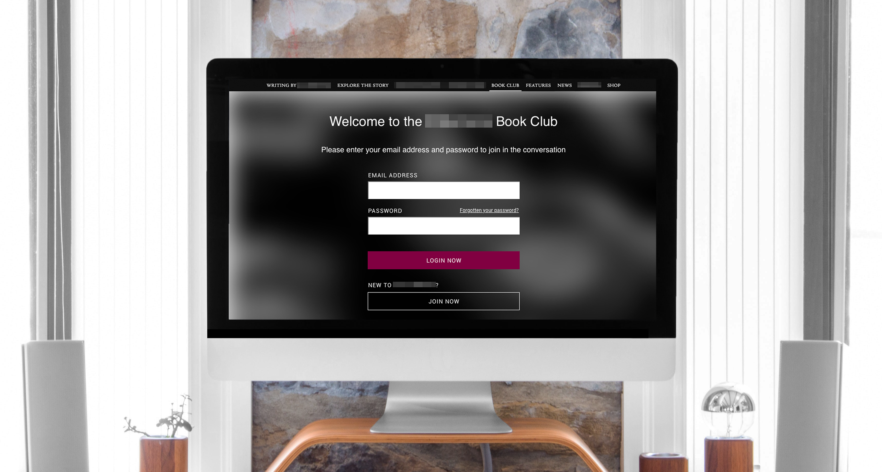
- Log in, log out, register and forgot password
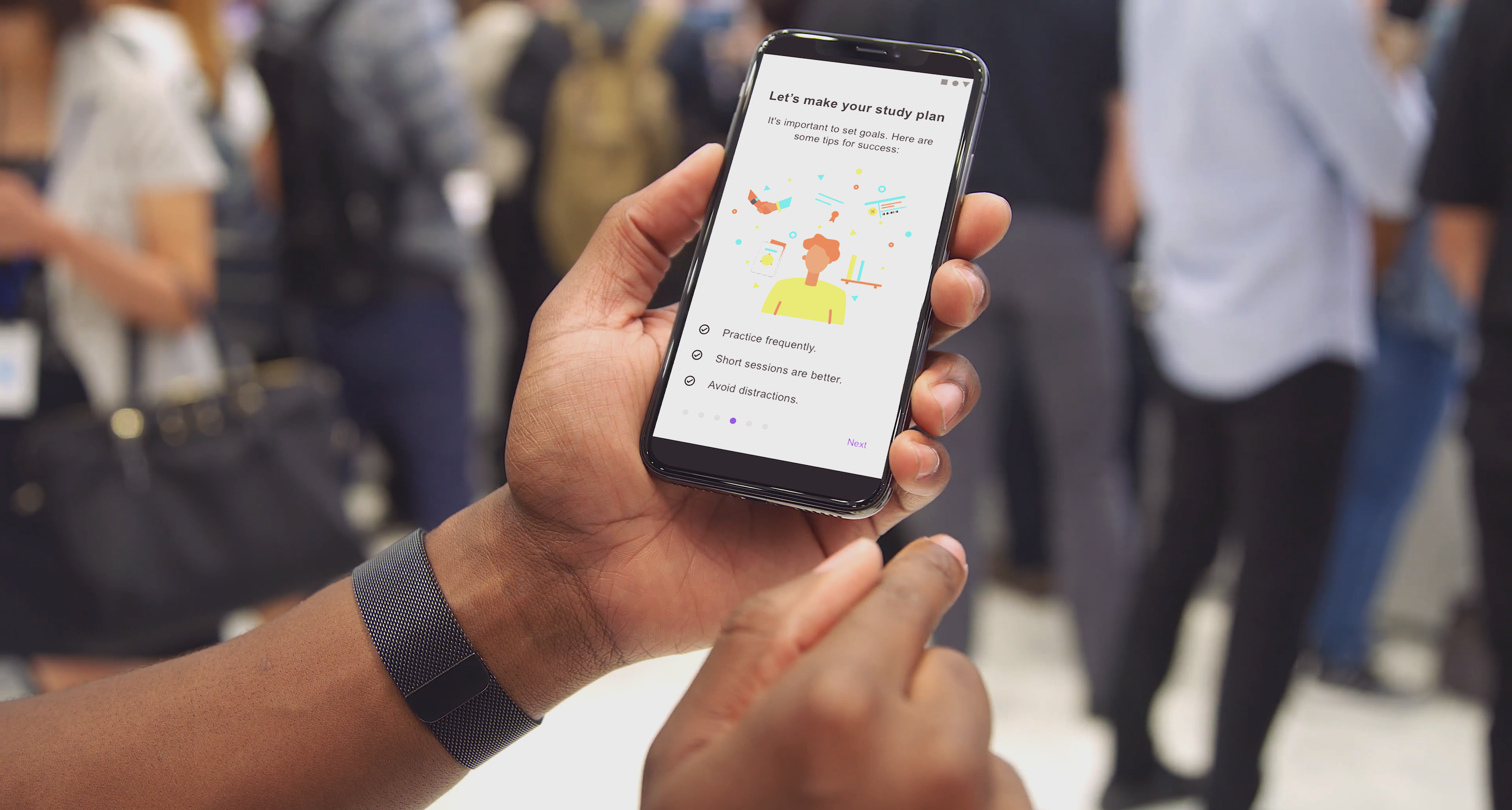
- Onboarding and profile setup
- Main menu
- Profile editing and maintenance
- Native notifications (just copy and mockups for this!)
- Learning and review activities, shared with the other designer
The Junior Designer and I held design review sessions at least once per week (plus whenever we felt we wanted to share work) to feed back on each other’s designs. I also regularly conducted consistency reviews to ensure elements were aligned across different screens in terms of spacing, colour, and so on.
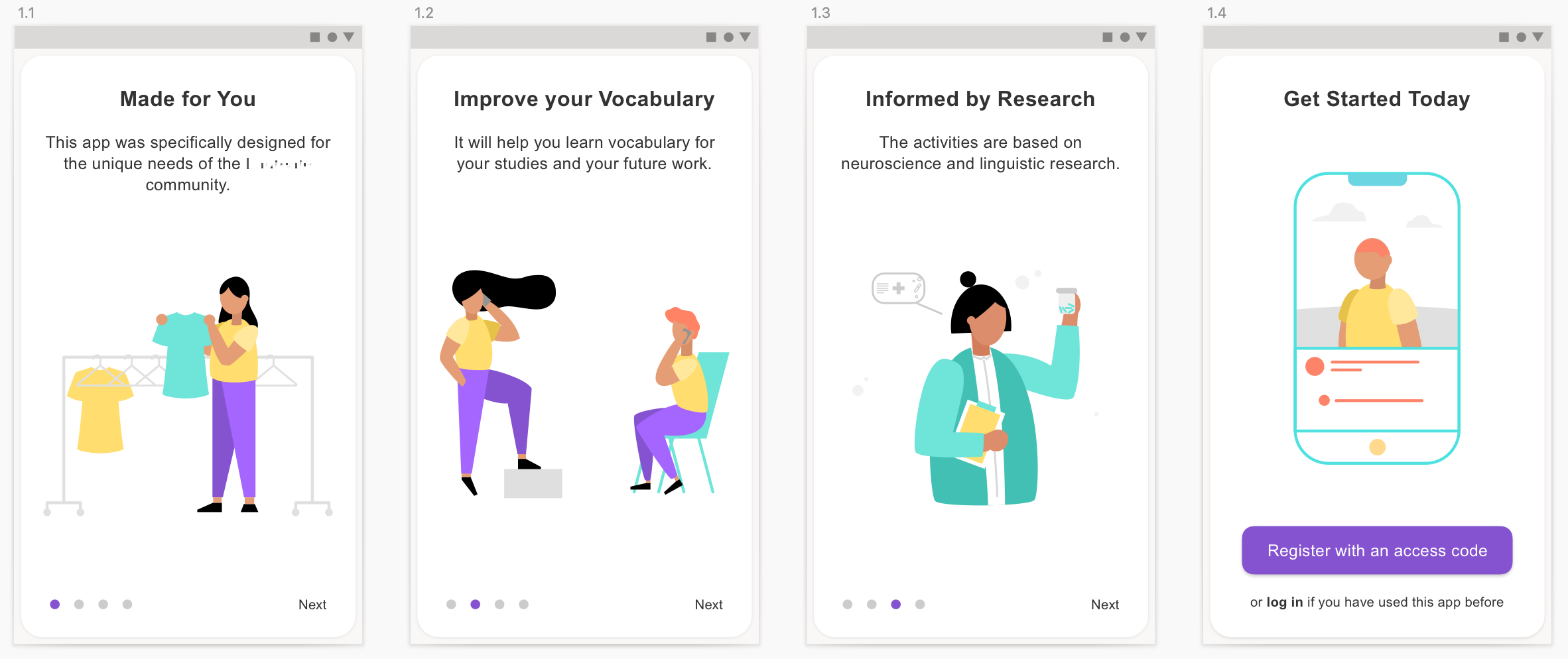
Introduction screens
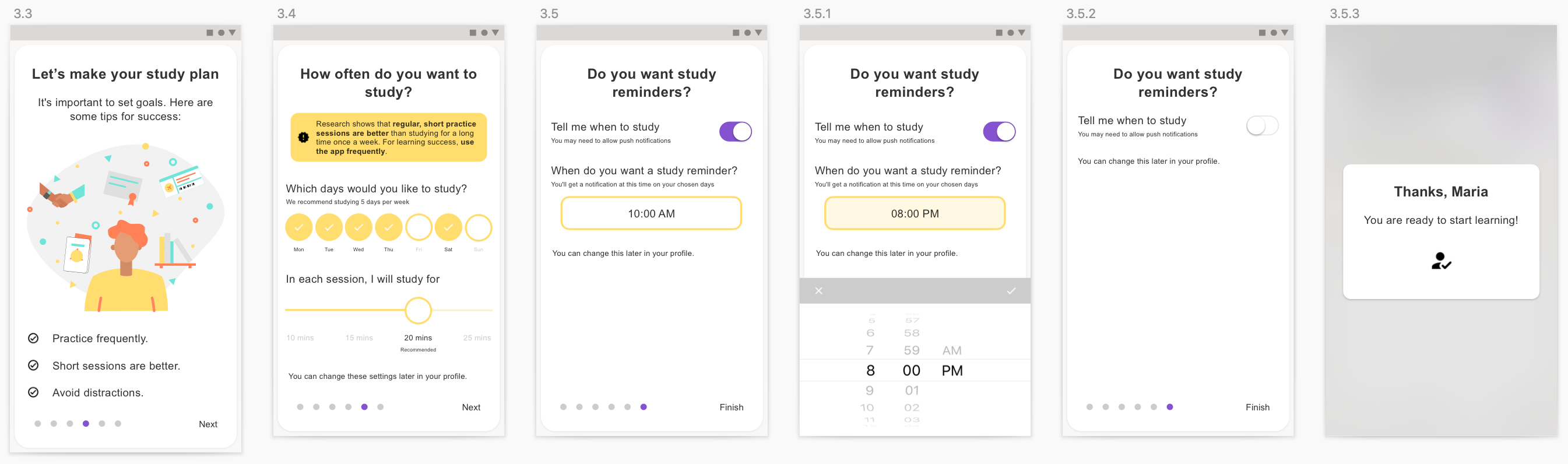
Profile setup screens
UX and copywriting
There were a few occasions where the UX was tweaked as part of this UI design process, and when this was needed I worked closely with the Product Manager to amend the user stories and acceptance criteria. I also worked on microcopy for the app, always careful to review this with the pedagogy expert / content writer on the team to ensure that the language was appropriate and understandable for the level of English we were targeting (B1 Intermediate).
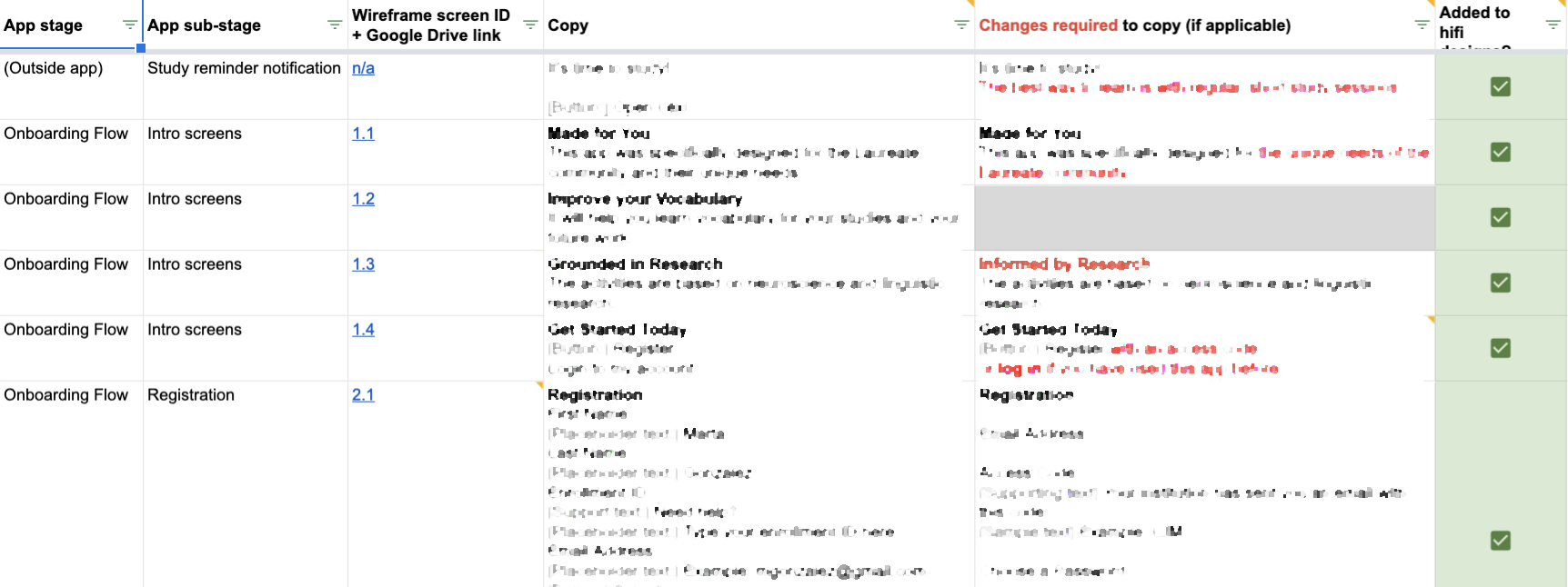
The copy spreadsheet, showing differences between proposed copy and revisions
User stories, flows and handover
While the Product Manager owned these tasks/documents, I reviewed all of the user stories, the LucidChart app flows and handover documentation to ensure this accurately reflected all of the functionality with in the app and to ensure there were no missing use/edge cases, error messages or screen states to consider — adding any missing ones to the designs, style guide and documentation where needed.
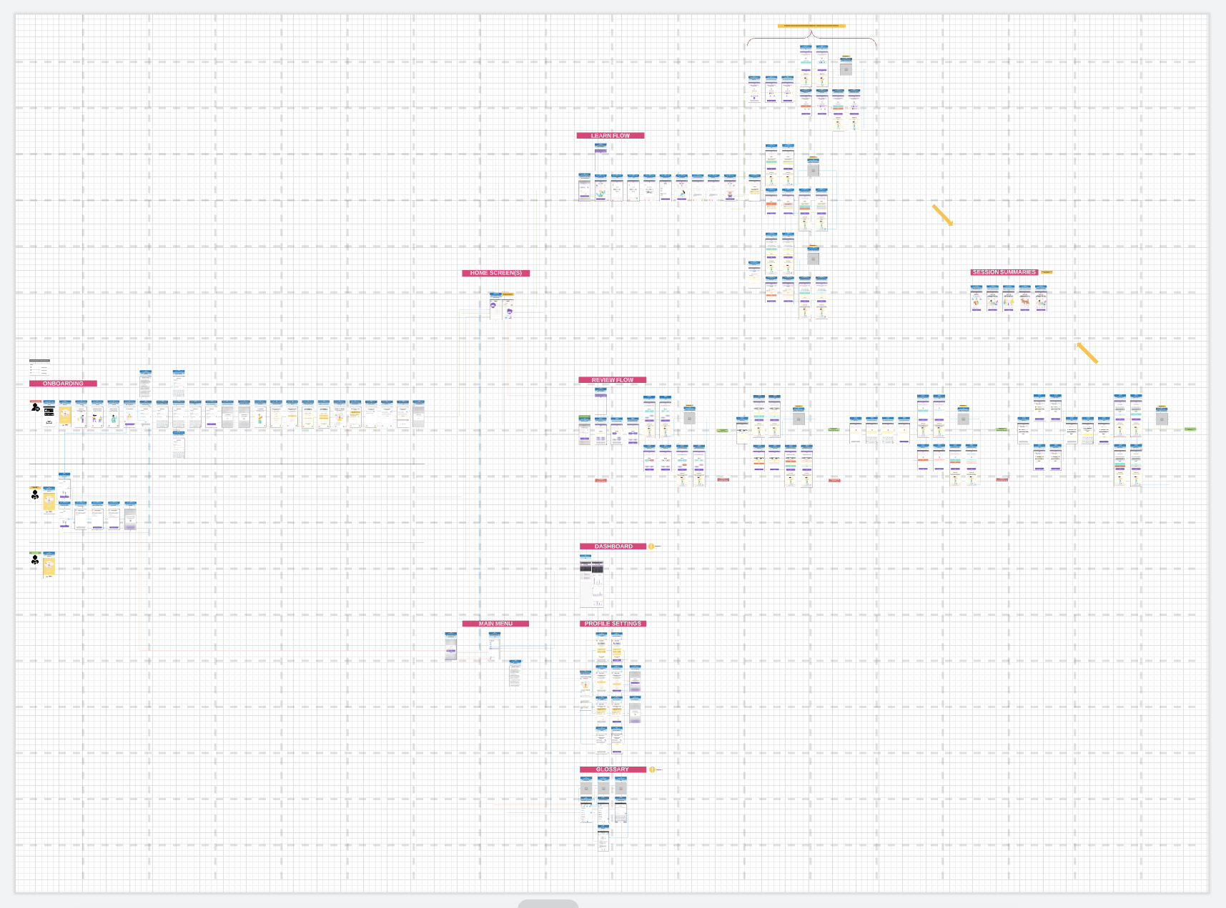
The full LucidChart app flow with all possible screen states
Final deliverables
- Design system document with principles, patterns, copy and accessibility guidelines
- InVision prototype of the full high fidelity app
- LucidChart app flow to show all paths through these screens
- Copy spreadsheet with all copy used throughout the app
- Trello board of suggested areas/ideas to consider in future releases
- Complete backlog with acceptance criteria for all screens in all states
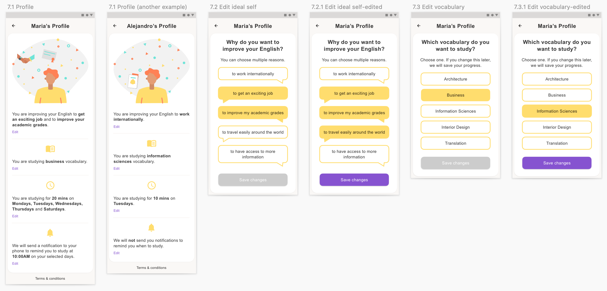
Profile screens
More profile screens
Phase 2: Usability testing
Having impressed upon the end client the importance — and usefulness — of doing usability testing prior to development, they decided to finance an additional project phase for precisely that. I was brought back onto the team to lead this usability testing phase, again with the support of a Junior (Spanish-speaking!) Designer.
Research plan
A short round of testing using the previous phase’s designs was recommended to resolve a number of potential issues. It’s impossible to put ourselves in the position of being a university student who needs additional language support, and as such these sessions with real users helped to validate assumptions made throughout the design process, ensuring we created a product that users find useful and usable.
Using the InVision prototype, we planned to conduct remote usability testing via Zoom with users around the world. The link to the InVision prototype would be sent to users at the start of the session (so they didn’t look through it in advance!) and users were warned during recruitment that they’d be asked to share their screens while using the prototype. Each session lasted for 1 hour, with the outputs then amalgamated into actionable changes to make within the app.
Our starting goal was to talk to a minimum of 5 users — this is usually enough to capture any usability issues that would impact use of the app — but ideally we were aiming for 7-8 users, to confidently catch most (or all!) usability issues and get good insights into users’ preferred homepage approach. We aimed to recruit mostly university students, plus 2-3 teachers to provide a slightly different perspective.
All of the recruited students were based in South America, and as such these interviews were conducted in Spanish by the Junior Designer. The teacher interviews were conducted in English, by me.
Research goals
With the first version of the app already designed (mostly to high fidelity), I wanted to conduct a round of testing with prospective users and their teachers. This ensured we invested development effort in the right features and functionality to provide maximum value to the international university’s student population.
- Understand if there are any usability issues – and identify if there are any screens that need changes to improve this (tested with both teachers and students)
- Validate the home screen approach we chose
- Establish a priority order of already-designed and potential features
- Explore whether students would feel inspired to keep using the app over time
- Explore whether teachers would champion the value of the app, how they see the app best integrating with the students’ lives, and any changes needed to enable that
- Identify opportunities to make the app more engaging and encourage ongoing use
The specific questions I wanted to answer were:
- Regarding usability testing of main app flows…
- Do users understand what the app is for?
- Do users understand how to use it?
- Can they get through a typical learning session in good time, and without help?
- Regarding the activities…
- Do users understand what’s required of them for each learning activity type? (Especially more complex activities)
- Is there anything we need to change to facilitate more effective learning through the activities?
- For students…
- Is the app engaging enough? Do they want to use it, and keep using it?
- What’s most important to them? If we could build only a small part of the app, what would it be?
- For teachers…
- Would they recommend this app to their students? And if not, what needs to change before they would?
- Is there anything we could change to make this app more helpful for their students?
- Is there anything that would get in the way of their students using this app?
- What’s the most important functionality for their students, based on their teaching experience? What’s least important?
Format
The sessions lasted no longer than 1 hour. After ~5 mins of setup and introduction, journeys were tested in the order below. These were planned to emulate as accurately as possible a user’s ‘real’ journey through the app – though at times we needed to explain the passing of time between sessions.
Users were asked to complete the following tasks on the InVision prototype, while “thinking out loud”, and encouraged to say anything that came to mind while moving through the screens, e.g. “that’s not where I expected that to be”, or “that was quick!”.
After the user completed each task, they were asked to rate the ease of completion out of 7 (a Likert scale), with some discussion around their score, and additional questions as outlined in the research goals. These questions differed slightly depending on whether we were speaking with a teacher or student.
The tasks were as follows:
- Register for an account and set up your profile
- Try and learn some new words (through 3 different activity types)
- Relaunch the app and find out what you need to do today
- Review some words that you’ve already learned (through 3 different activity types)
These tasks, which made up the bulk of the session, took 7-10 mins each (~40 mins total).
There was then some guided exploration through the remaining features (some of which were not yet designed). This established what users expected to see in each area, and how they expected the functionality to behave:
- Glossary (and ‘Mastered’ words)
- Main menu
- Profile
- Dashboard
Finally, we discussed some ideas we’d had for future functionality. This was left until the end of the session to avoid leading users before they’d given their full feedback. We expected users to generally be positive about adding additional features (people always want more!) — so this section of the testing was mainly to weed out ideas that solicited negative response.
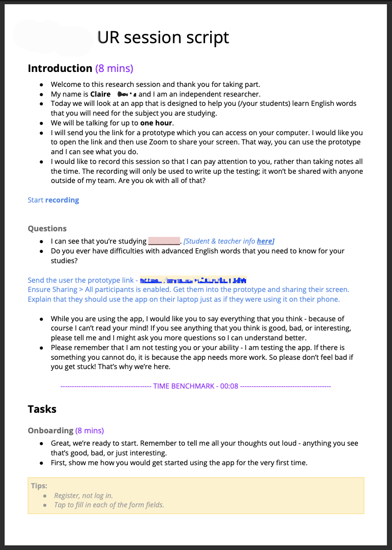
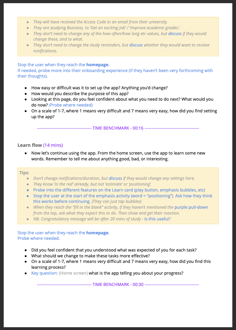
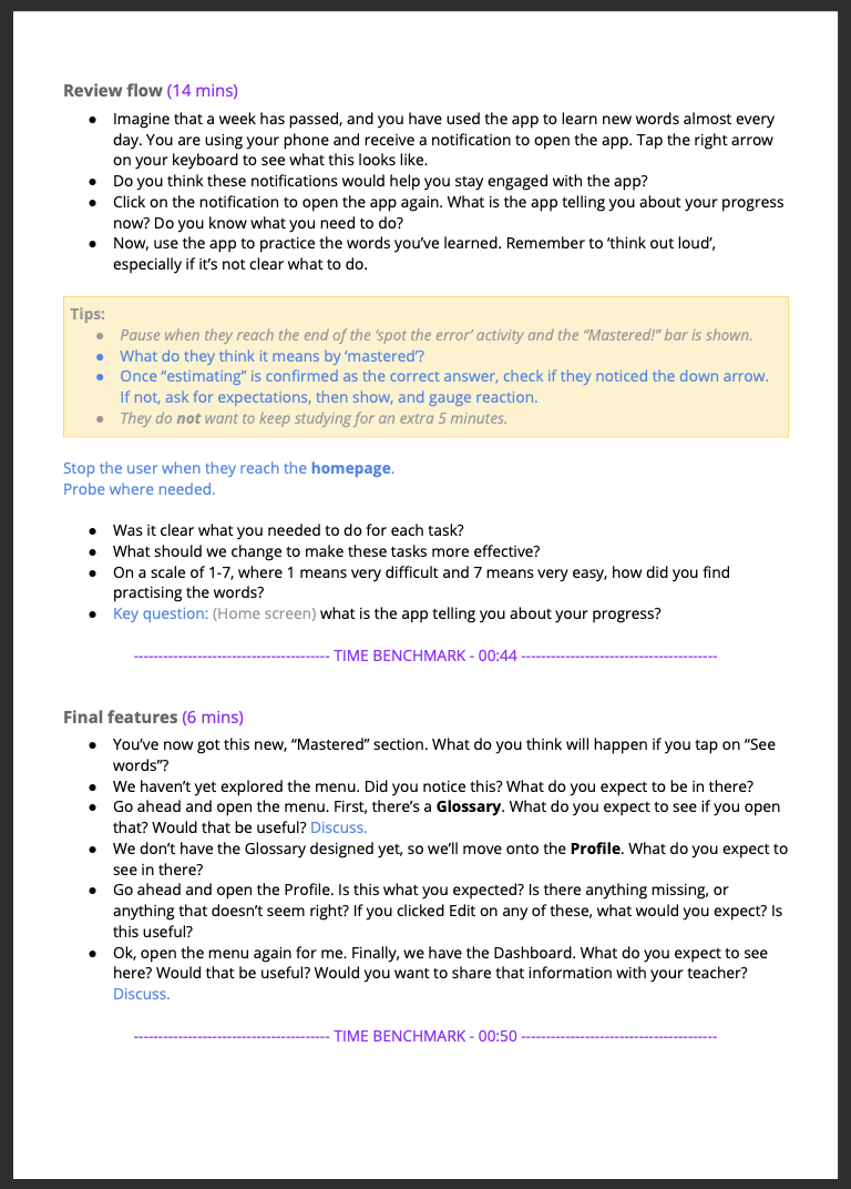
Usability testing script
Outputs
With the research complete, all feedback was noted on digital sticky notes in the online tool Mural, and organised into affinity groups to prioritise common feedback and where we needed to make changes.
In addition to the qualitative feedback, we also had the scores out of 7 for each exercise. These are useful as a high level health gauge for the current usability of the app at that moment in time, and told us which areas were better or worse than others.
These findings combined were then summarised in a research report with recommendations in priority order, and handed over to the client to inform the next stages of the project.
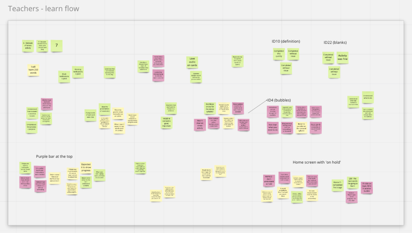
Affinity mapping research outputs
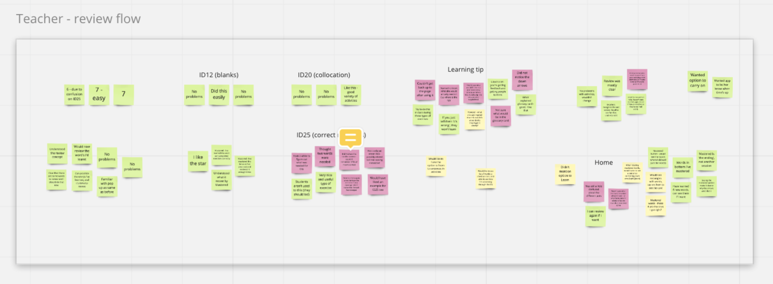
Affinity mapping continued
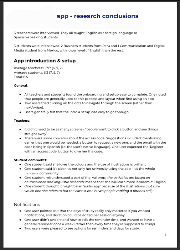
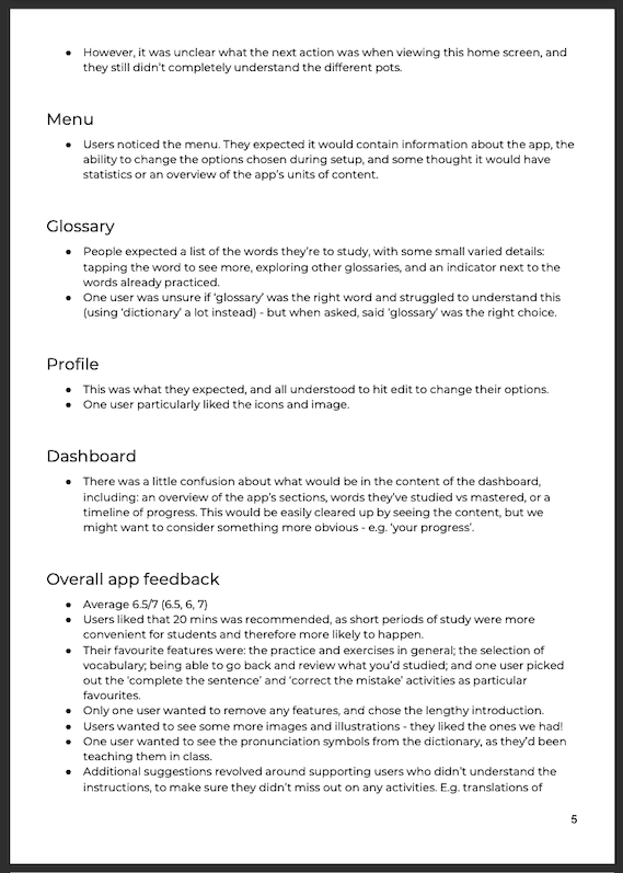
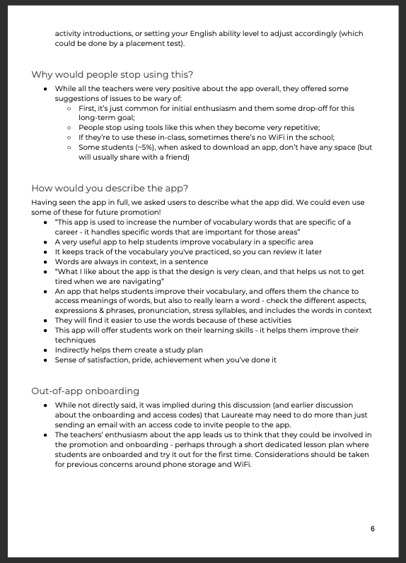
The final research report